OK, time to see what kind of data do we have and how to play with them. From the beginning we start with simple naive positivists approach.
What we have – polygons
1. 373 sampled polygons; 353 of them walked/sampled once at least (= 20 polygons were not suitable for sampling overall), 348 of them sampled 2 times at least, 337 of them sampled 3 times at least and 222 of them sampled 4 times (in all 4 seasons were “sampleable”). These 222 polygons (59.5% of all polygons) are of mine eminent interest.
Wanna SQL query how to get this?
/*vybira jen polygony, ktere byli zkoumany ve vsech 4 sezonach*/
SELECT COUNT (DISTINCT (“id_polygon”)) FROM tab_polygony_sezony ou
WHERE (SELECT COUNT(*) FROM tab_polygony_sezony inr
WHERE inr.”id_polygon” = ou.”id_polygon”) > 3;
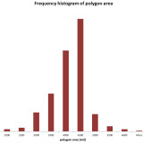
Polygons are of various area considering the fact I have delimited them according plots/fields boundaries as I wrote in diss 01. Fig. 01. shows the frequency histogram for a polygons areas, it is clear then most polygons had 4000-5000 square meters.
What we have – finds
We have 11 999 finds altogether of 63 612 g weight; Fig. 02 showing the number and the weight for every season, Fig. 03 and Fig. 04 showing the types ratio of artifacts.
Wanna SQL for this?
/* vaha nalezy po typech – window funkce*/
SELECT DISTINCT(material), SUM(“vaha”) OVER (PARTITION BY material) AS Vaha_ker
FROM tab_finds;
Pottery is most the most often kind of find, there are 9542 pieces of weight 45.3 kg.
Average weight for a find is 5.3 g, the average weight of ceramic fragment is of 4.75 g. However the typical weight (median) is about 1/2 g of pottery fragment as Fig. 05 indicates (the frequency of pottery weight). The average length of a ceramic specimen is 24.5 mm, the average width of 20 mm.
What we have – dating the samples
The dating of surface collection samples is usually tricky because of fragmentation. However we were able to date the pieces at least generally (e.g. prehistory; recent etc.). Fig. 06 shows the dating of all finds, Fig. 07 the dating of a ceramics exclusively.
- All types of finds divided according dating.
- Dating of the pottery fragments.
It seem both charts are in positive correlation. Well, there are a few things suspicios – the high ratio of prehistoric finds, almost absent protohistory (Roman/barbarian) and quite sparse middle ages fragments.
Loading into GIS
OK, lets load everything into GIS and get some cartograms of distribution (“where what”, concentrations and so on). I will start this with ‘naive’ attitude and just push the data as are into GIS.
First of all I wanna see the distribution of pottery in distinct seasons (season per season) assuming the distributions have to equal in some extent (I simply presume every season shows the same “sites”, more or less…) – figs. 08 – 11.
Wanna SQL for this?
/*asking for pottery weight divided by polygons and for just one season – change season number in where clause */
SELECT DISTINCT(id_polygon), datation, material, sum(“vaha”) OVER (PARTITION BY id_polygon) AS Vaha_ker
FROM tab_finds
WHERE material = ‘keramika’ AND season = 1 AND datation BETWEEN 1 AND 1999
ORDER BY id_polygon;
- Season 1, prehistoric pottery.
- Season 2, prehistoric pottery.
- Season 3, prehistoric pottery.
- Season 4, prehistoric pottery.
Although it seems we found the correlated concentration (somewhere southeastern part of trajectory), a closer lok to this section is not so clear – figs. 11 – 15.
- Season 1, prehistoric pottery.
- Season 2, prehistoric pottery.
- Season 3, prehistoric pottery.
- Season 4, prehistoric pottery.
So, better than looking on colored circles I would throw the section of data in some objective formula. From the polygon 290 until 373 I took the absolute values of prehistoric pottery weight (fig. 16) and feed the correlation algorithm. The results are following (fig. 17):
1. there is weak negative correlation among the season 1 and others
2. there is no, or weak correlation among season 2 and others
3. there is some, but not strong correlation between season 3 and 4
- Fig. 16. Absolute weight o fprehistoric potery by seasons.
- Fig. 17. Correlation table of fig. 16.
OK, that’s bad, mainly the negative correlation among the season 1 and others. What about, lets say, medieval sherds? They are more numerous so this primitive statistics would be more reliable. Distribution of medieval sherds on polygons 290 – 373 is on figs. 18-21.
- Fig. 18. Medieval pottery distribution, season 1.
- Fig. 19. Medieval pottery distribution, season 2.
- Fig. 20. Medieval pottery distribution, season 3.
- Fig. 21. Medieval pottery distribution, season 4.
OK, let’s throw an eye on correlation tab – figs. 22-23.
- Fig. 22. Table of medieval pottery weight in season 1- 4.
- Fig. 23. Correlation matrix derived from tab on fig. 22.
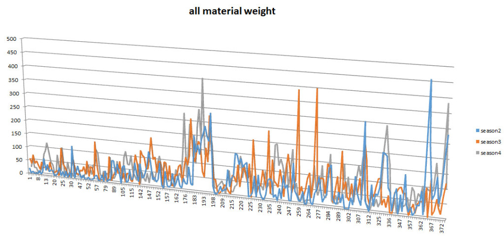
The results are pretty bad – the best is “no correlation” but the most is negative correlation among seasons. Strange – every season shows quite different distribution. Time to lose my nerves and load all available data to all polygons, based on material weight. I omit the season 1 while giving most negative correlations with the rest. While the whole map would be unclear and the trajectory is linear, I could use a simple 2-dimensional chart (X axis of polygons and Y axis of all material weight) – Fig. 24.

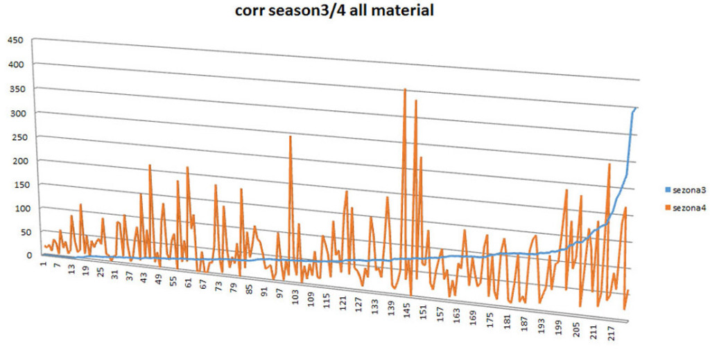
What about the correlation among curves? Is there patterning in all 3 seasons distribution? Hard to say (or to see) so lets order one curve ascending and reorder another curve along to see possible correspondence – fig. 25.

Well, no way. There is no common tendency and the overall distributions are not in the correlation. Starting to feel hopelessness I would jump to more sophisticated statistical attitude…


